Mohács 500
This project, the design of Mohács city's visual identity, was created in response to a competition announced on the occasion of the 500th anniversary of the Battle of Mohács.
scroll down to read more
At the outset of this design project, among the collected keywords, 'Christianity' stood out as the central theme to be embodied in the logo. To achieve this, I devised a foundational grid system that pays homage to the shape of a cross, the windows of churches, and the silhouette of the Mohács Historical Memorial Site.
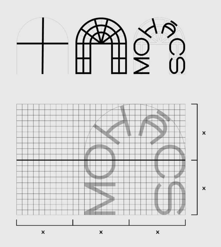
Even before the design process commenced, it was clear that I wanted to harmoniously integrate the words 'Mohács' and '500,' rather than present them independently. As a result, I crafted the word 'Mohács' based on the curved form reminiscent of church windows, while forming the number '500' along the midpoint line. The horizontal line, passing through the vertical center of the grid system, defines the depiction of the second keyword, 'Duna' (Danube), alongside the number '500.' The curved layout and the rounded forms of 'O' and 'C' characters allow for a dual interpretation, representing both '500' as a number and the cultural significance of the river.
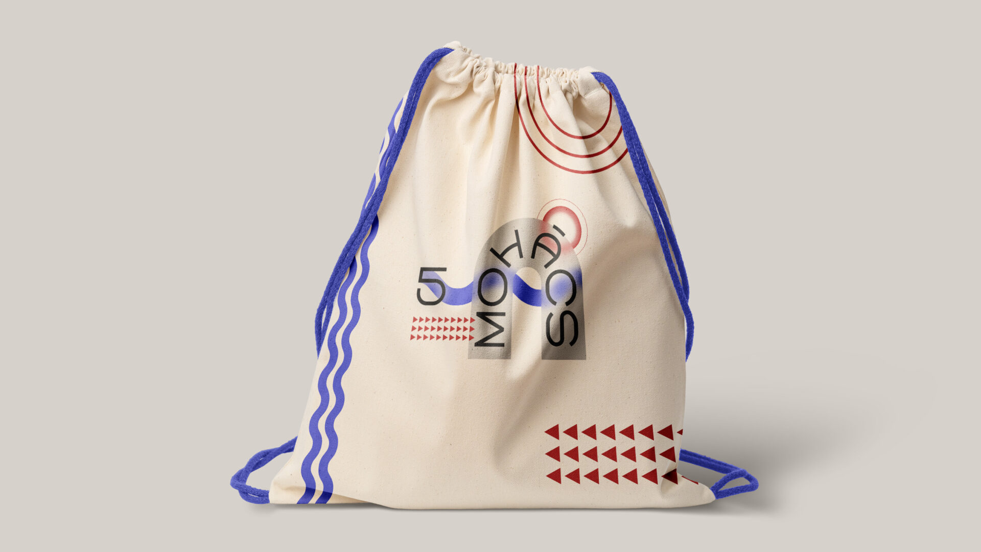
For merchandise, I aimed to appeal to a younger demographic, opting for a vibrant, playful, and cheerful design that almost evokes a festival atmosphere. The contrast between the playful canvas bag and the simplicity of the business envelope highlights the versatility and flexibility of the brand identity.
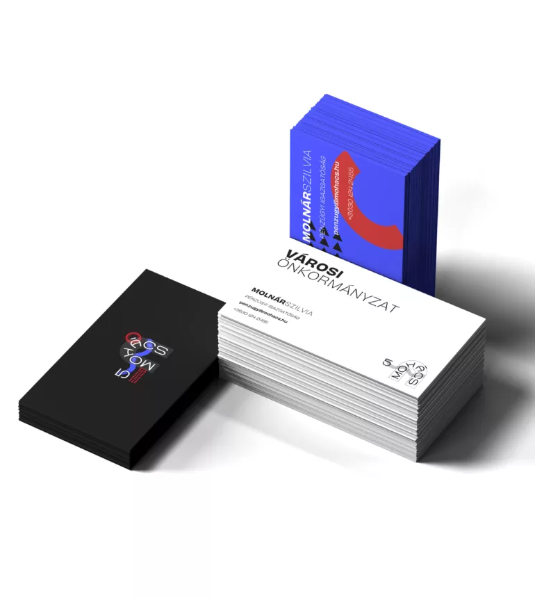
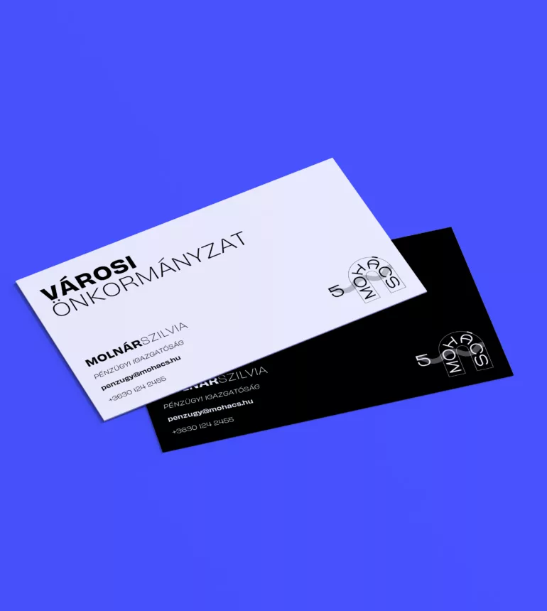
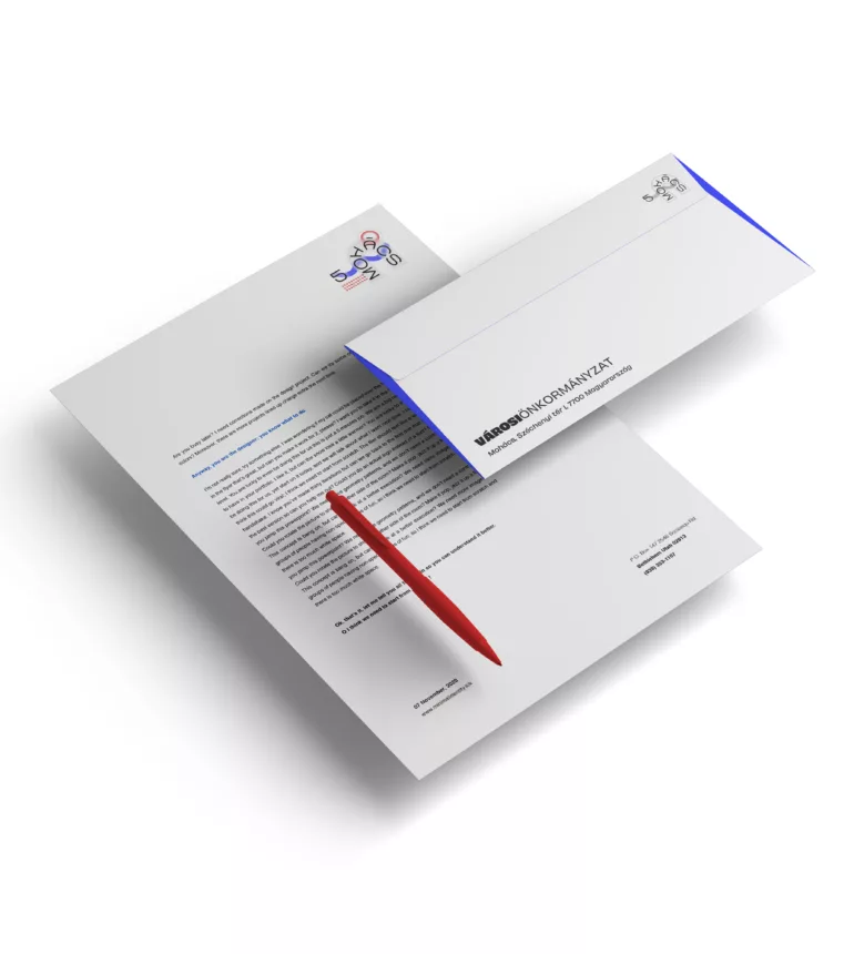
The envelope and letterhead demonstrate the brand's adaptability to analog communication, emphasizing its understated integration.
The 2/3 and 1/3 column layout is echoed here without decorative elements. The colored logo on the letterhead is, of course, replaceable if a more serious and minimalist impression is desired.
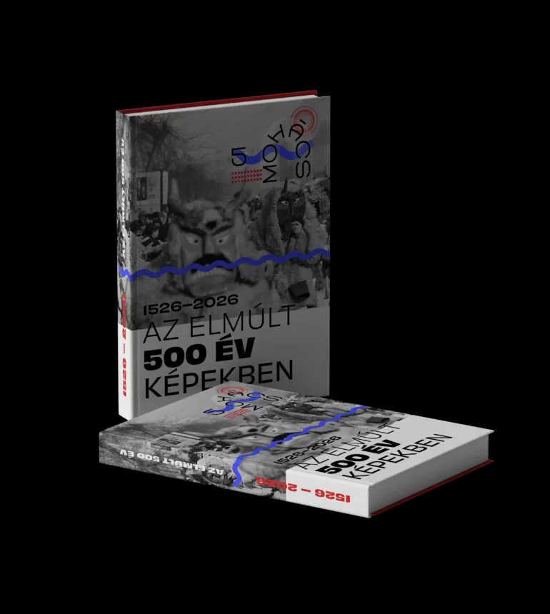
Beyond the book cover, this design showcases two key identity elements: the wavy line representing the Danube intersects at the midpoint, and the 2:1 aspect ratio is observable in the black-and-white section. Even without the logo, the design harmonizes seamlessly.
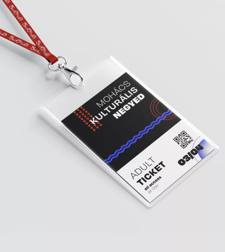
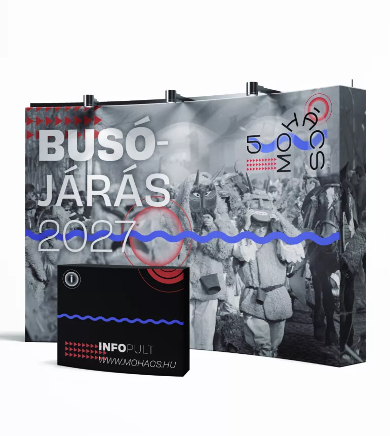
In addition to visually striking, vibrant geometric elements, archival photographs are used to convey tradition and remembrance, harmonizing with the fresh and youthful brand identity. These images, combined with the 'Tradition and Innovation' slogan, are designed to answer the call for a compelling presentation. The square grid proportions defined by the logo dictate the layout for other surfaces:
a) The wavy line (representing the Danube midpoint) appears along the midpoint line. b) Additional graphic elements (e.g., photos or colored spots) are arranged in a 2:3 ratio.