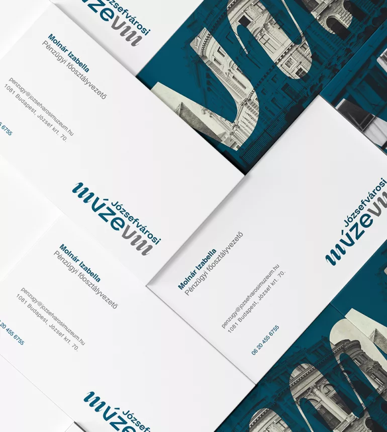
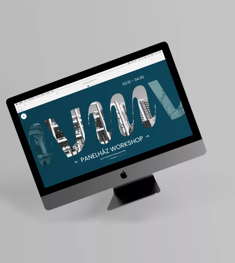
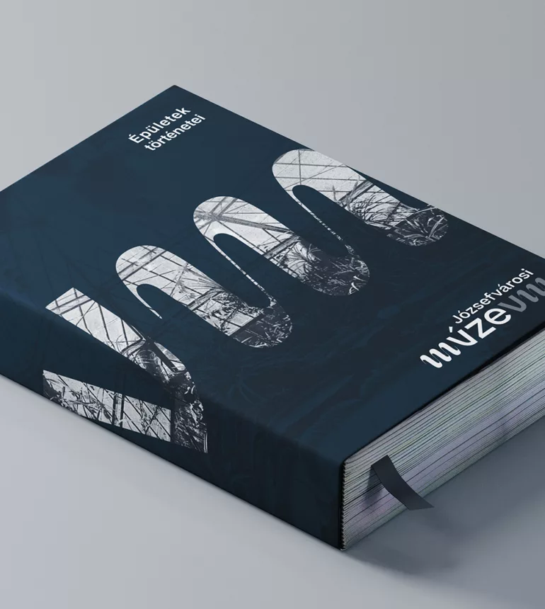
Józsefvárosi Múzeum branding
When designing the branding for the Museum of Józsefváros (Józsefvárosi Múzeum – a museum in the VIII. disctrict in Budapest), it was essential to thoroughly study the characteristics, conditions, and buildings of the area. The Gutenberg Home is located in this very disctrict, and I wanted to pay tribute to Johannes Gutenberg by creating a typographic logo.
scroll down to read more
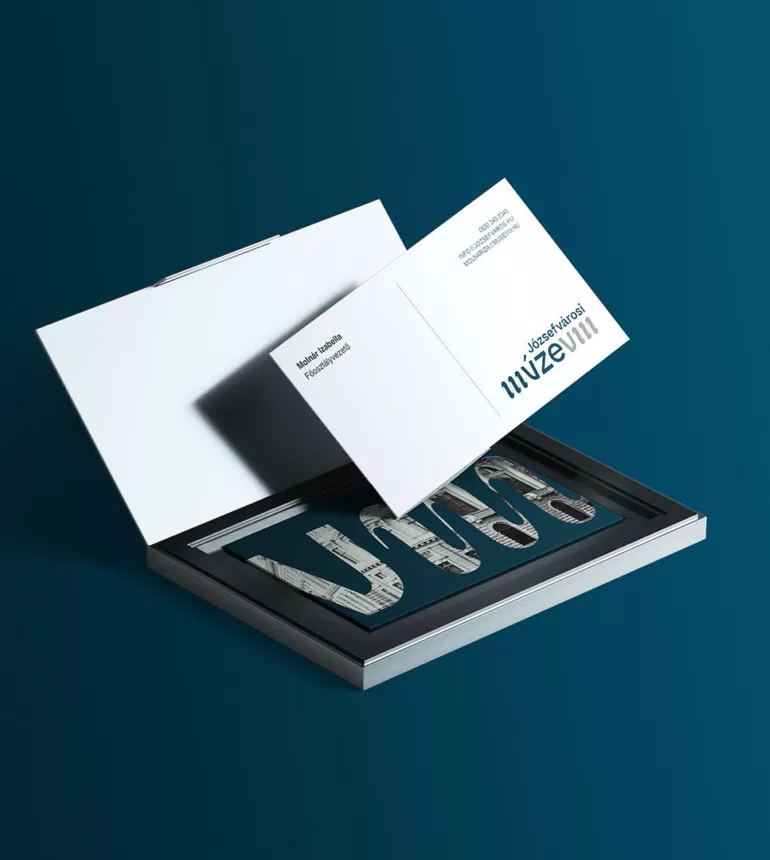
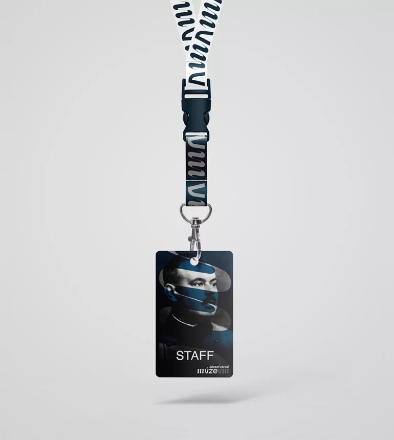
The logo is based on a visual game: the last two letters of the word "museum" form the Roman numeral eight. As the traditional ABC character set lacked certain letters, including the letter U, I started playing with the MVSEVM inscription. Along with evoking old times, I aimed to showcase the diversity and eclectic character of the district in the logo by using different font types: a script M, a custom-designed U, and a sans-serif geometric letter with a restrained character that doesn't overpower the overall harmony. I discovered a visual similarity between the last two letters of the word and the district's number and strived to create a visually appealing and sophisticated logo while incorporating my defined keywords.
The logo's interest lies in its harmonious combination of three different font types and its false axial symmetry.
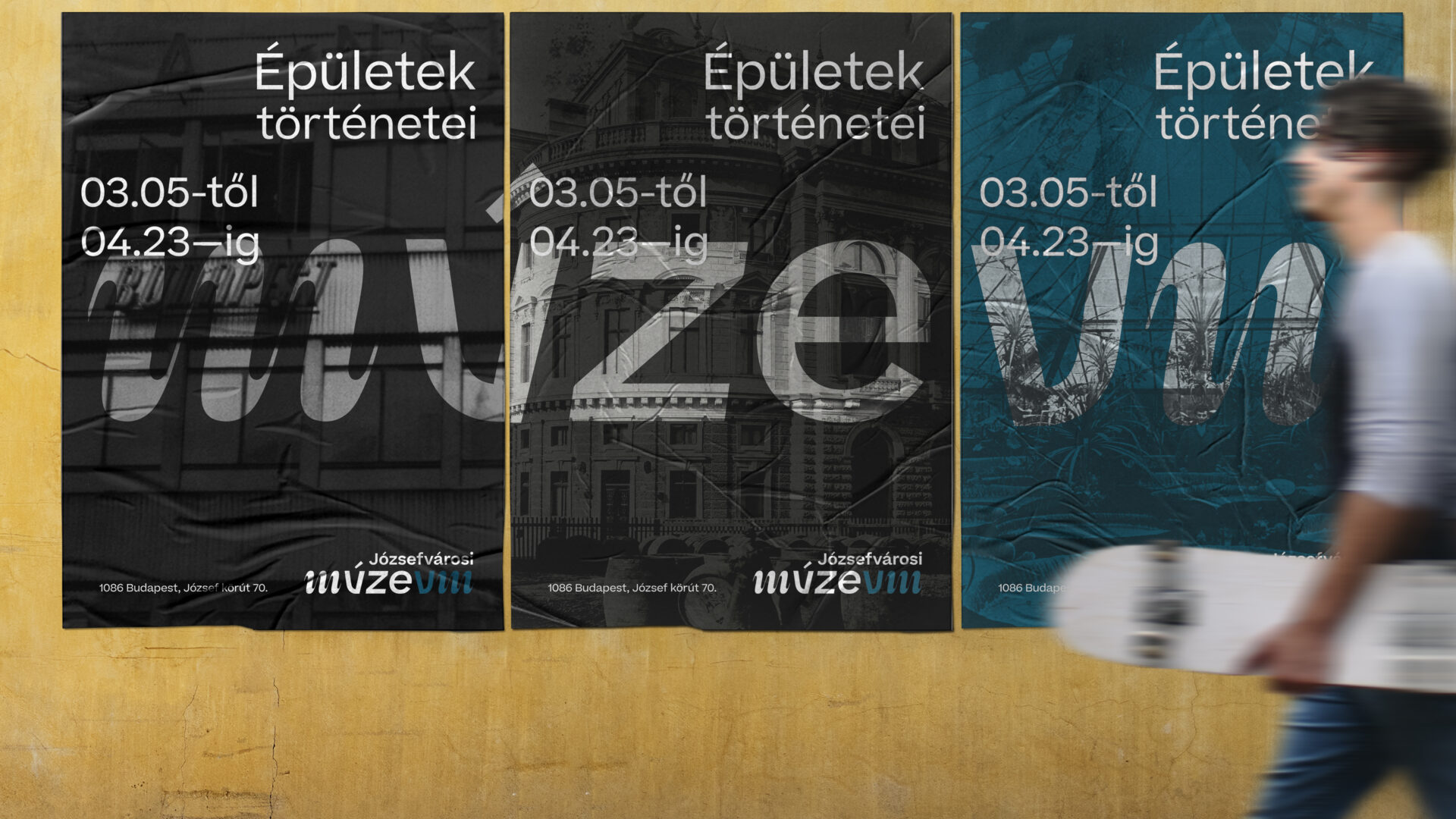
Regarding the brand, when defining the visual guidelines, colors, and grid system, I tried to merge the district's atmosphere with the seriousness and professionalism that the future institution should radiate. The steel blue and graphite gray colors evoke the many railways, the centers of public utilities serving the capital, and the rapid construction characterizing the growing neighborhoods.
The logo's main graphic element is the digit eight, which serves as a standalone district designation and also fits perfectly as the last two letters of the word "museum" in the logo.
The entire branding is characterized by the 2:1 aspect ratio derived from the logo (wherever the carrier allows: posters, letterhead, tickets, etc.).
